Correlation Analysis
Xi Zhou and Luiza Fabreti
2024-03-04
Source:vignettes/correlationAnalysis.Rmd
correlationAnalysis.RmdInitial Situation and Goal
In many use cases, we want to reduce large data sets based on the correlation between the variables and further be able to reorder the data set. Thus, we need a correlation analysis.
There are three different situations :
- Correlation between numerical variables
- Correlation between categorical variables
- Correlation between numerical and categorical variables
In the following, we will work through it all.
Correlation Analysis
In this example, we will start with the 'Cornerstone'
sample dataset 'solar_panel_production'. The dataset
contains in total 123 variables and 7333 observations, both categorical
and numerical data are included.

show the to analyzed data
- Categorical data:
"Shift","Chamber","Block"etc. - Numerical data:
"Temperature","Pressure","Effic.%"etc.
Choose the menu 'Analyses' \(\rightarrow\) 'CornerstoneR'
\(\rightarrow\)
'Correlation Analysis' as shown in the following
screenshot.

correlation analysis menu
Numerical vs Numerical Variables
(If you want to reorder the data, put all variables in predictors in order to obtain a symmetrical matrix)
In the appearing dialog select 'I_sc'
'V_oc' and all 'Temperature_xAve' as
predictors, and leave responses blank

correlation analysis: variable selection
'OK' confirms your selection and the following window
appears.

correlation analysis: R Script
You can customize the calculation by different settings. To do this,
we open the menu 'R Script' \(\rightarrow\)
'Script Variables'. The screenshot shows the default
options.

correlation analysis: script variable
Following options are available:
- type of correlation measure (only) for numerical
variables:
'pearson'or'spearman' - type of ordering:
-
'FPC': first principle component -
'AOE': angular order of eigenvectors -
'Alphabet': alphabetical order -
'Original': original order from data set
-
- different confidence levels:
from
'0.9'~'0.99' - remove insignificant correlations based on confidence level:
'yes'or'no'(tick box)
We will now use the default settings. Close this dialog with ‘OK’ and
click the execute button (green arrow) or choose the menu
'R Script' \(\rightarrow\)
'Execute' and all calculations are done via
'R'. Calculations are done if the text at the lower left
status bar contains 'Last execute error state: OK'. Our
results are available via the menu 'Summaries' as shown in
the following screenshot.

correlation analysis: summaries
The menu 'Correlation Matrix' displays all the
correlations between the variables.

correlation anlysis matrix
The menu 'Sorted Correlation List' displays the pairwise
correlations with their p-value.

correlation anlysis: sorted correlation list
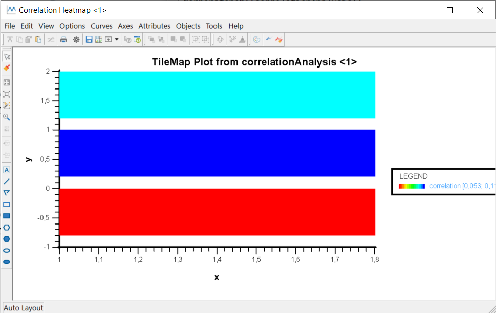
To have a better overview of the correlations, we can have a look at
the correlation Heatmap, by selecting 'Graphs' \(\rightarrow\)
'Correlation Heatmap' in the R Script menu. The following
window with the requested graph appears. Since we have a symmetrical
matrix, it is sufficient to show the lower triangular matrix.

correlation analysis: Heatmap
Categorical vs Categorical Variables
For categorical variables we use Cramér’s V, which is computed by taking the square root of the chi-squared statistic divided by the sample size and the minimum dimension minus 1. The confidence interval for Cramér’s V is estimated using the bootstrap technique. Please note that this method is not reliable when Cramér’s V is close to 0, 1, or when the sample is small.
Open the dataset and variable selection again and this time, we choose the variables as shown in the following picture.

correlation anlysis: categorical variales
Now let’s customize the settings via the menu 'R Script'
\(\rightarrow\)
'Script Variables'.
Due to different dimensions of predictors and responses, we are not
able to reorder the data. Thus,the order from the original data set will
be kept. So in this case the only options we can change are
'Confidence Level' and
'Remove Insignificant Correlations'. Set the script
variables as shown in the screenshot.

correlation anlysis: asymmetric categorical settings
Now close this dialog with 'OK' and click the execute
button (green arrow). Open the 'Correlation Matrix' and
'Sorted Correlation List' under 'Summaries'
menu. The result will be like in the following screenshot. The missing
values indicate that the correlations between some variables are not
significant.

correlation anlysis: asymmetric categorical matrix without NA

correlation anlysis: asymmetric categorical list without NA
Open the 'Correlation Heatmap' in the summary
'Graphs' menu. For the asymmetrical matrix, the graph will
look slightly different than in the symmetrical case.
correlation anlysis: asymmetric categorical Heatmap
Numerical vs Categorical Variables
(put categorical variables in predictors and numerical variables in responses)
To compute the correlation between numerical and categorical variables, we use linear regression and in rare situation \(R^2\) could be negative, thus correlations are computed by the following formula: \[ correlation = sign(adjR^2) \times sqrt(|adjR^2|) \]
Open the dataset and variable selection again and this time, we choose the variables as shown in the following picture.

correlation anlysis: categorical variables
Now close this dialog with 'OK' and keep the default
settings. Then click the execute button (green arrow) and open the
'Correlation Matrix' and
'Sorted Correlation List' under 'Summaries'
menu. The result will be like in the following screenshots.

correlation anlysis: asymmetric numerical/categorical matrix

correlation anlysis: asymmetric numerical/categorical list
Open the 'Correlation Heatmap' in the
'Graphs' menu to see the Heatmap. 
Remarks
If you get an error message or a strange output, pay attention to these aspects:
- if a “not enough finite observation” message is thrown, check your dataset. Your data may not contain enough non-NA values (less than 3) to perform the test strategic. Try to include more observations.
- if an “invalid comparison with complex values” message is thrown, you probably want to order the data variables using AOE, but AOE ordering is only defined for non zero eigenvalues, so after taking square out of the negative value, the result is a complex number. Try to use another ordering like FPC for your data.
- if an “eigen(corr):infinite or missing values in ‘x’” message is thrown, you probably want to order the data using AOE or FPC. However, your correlation matrix is probably very small and at the same time, it contains missing values. Try to use the ordering ‘original’ or ‘alphabet’, they are more generic.
This function will not accept data with missing values for predictors and/or responses. If your data contain rows with missing values, we recommend using the function Handling Missing Values beforehand.